The Coastierge / Amalfi Coast, Italy
Turning local expertise into a service travelers can book.
I took The Coastierge from an unresolved founder vision to a live service with two ways to plan the Amalfi Coast: choose a guided experience or build a trip with a local.
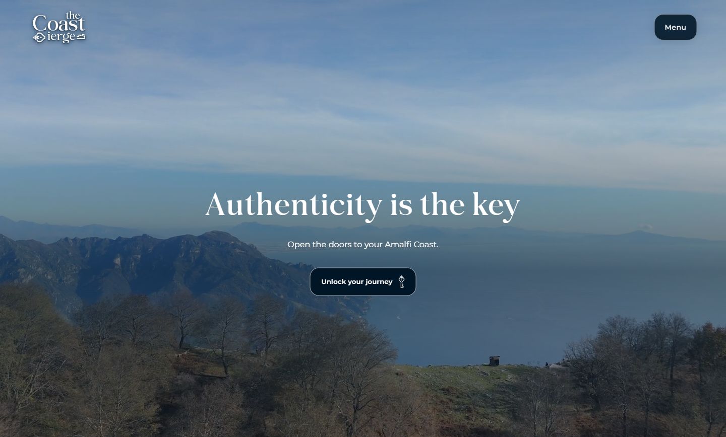
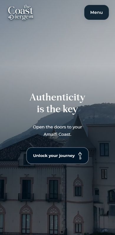
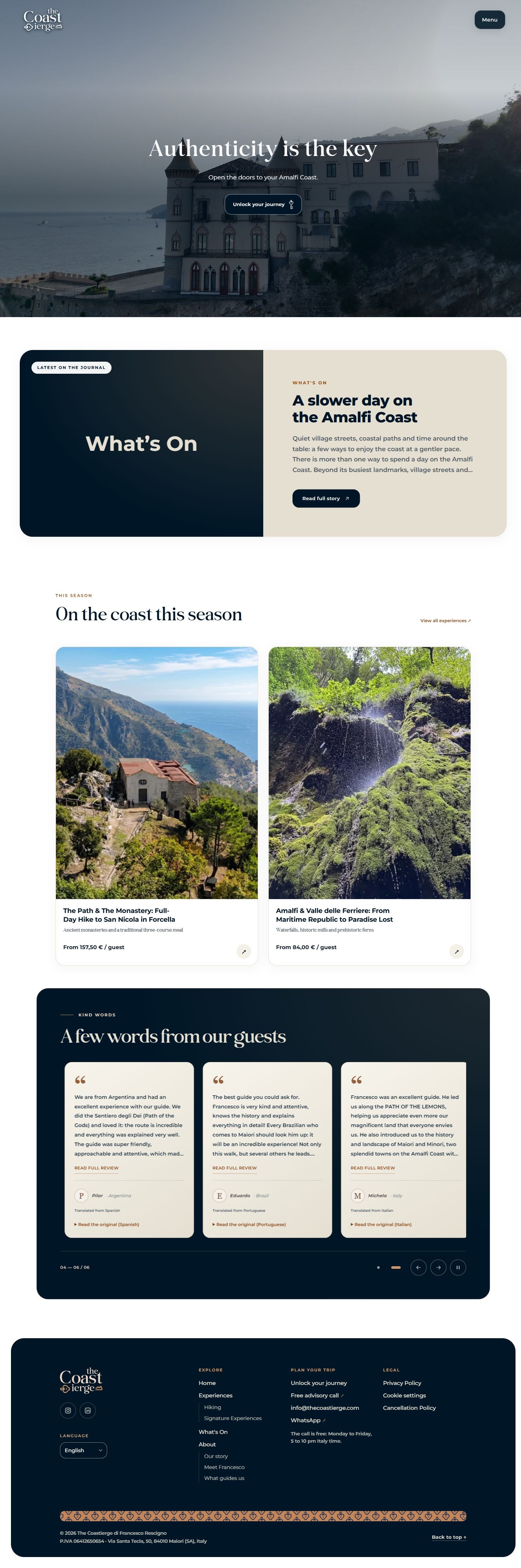

The live homepage at 1440 px and 390 px viewport widths. Open either full page to see all sections at that viewport width.
01 / The problem
The founder had the local knowledge. The product still had to be defined.
Before I joined the project, Francesco told me in an informal conversation how frustrated he was. He saw a need for a more personal way to experience the coast and knew what he could offer as a local, but he was struggling to turn that knowledge into a service travelers could understand and act on.
My role began with that ambiguity. I worked with Francesco to define the offer and how travelers would enter it, then took responsibility for the UX, UI, development and QA.
02 / Product structure
Design for two levels of intent.
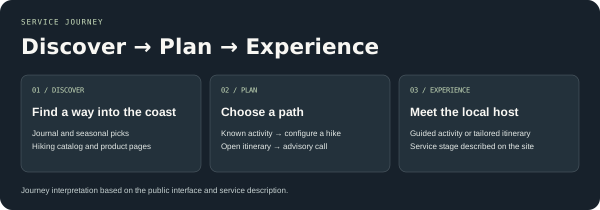
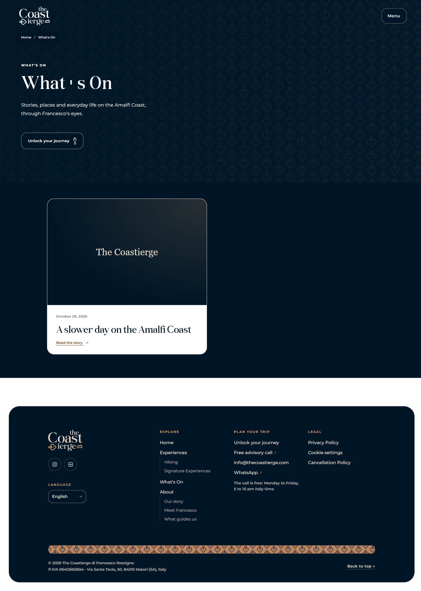
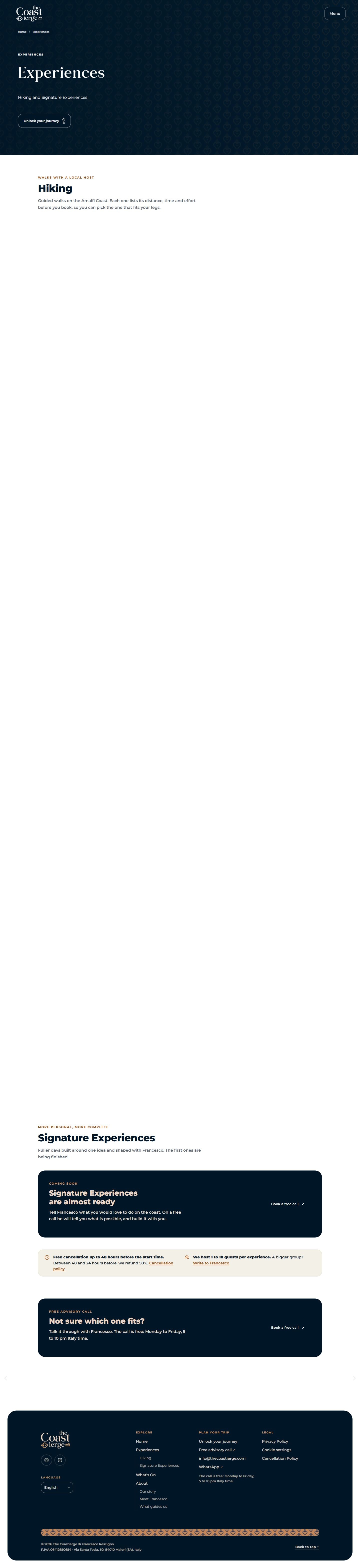
A traveler who already knows which hike they want needs practical details and a booking path. Someone still deciding how to spend their time needs a conversation. I gave each a clear entry point and used editorial content to help visitors get oriented before either decision.
01 / I know what I want
Choose an experience
The catalog leads to a specific hike with its own itinerary, constraints and booking controls.
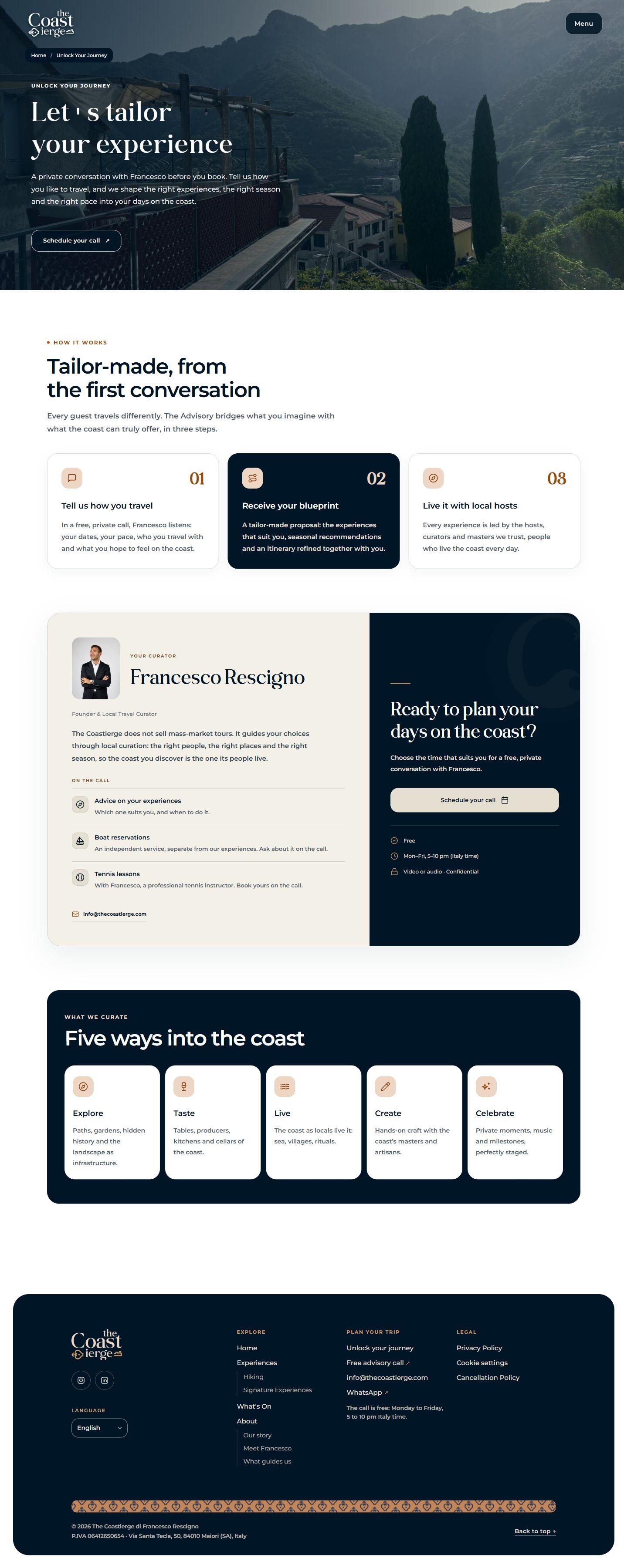
02 / I need guidance
Plan it with Francesco
Unlock Your Journey explains the tailored service and offers a free advisory call.
03 / Interaction design
Put the information that determines fit next to the booking decision.
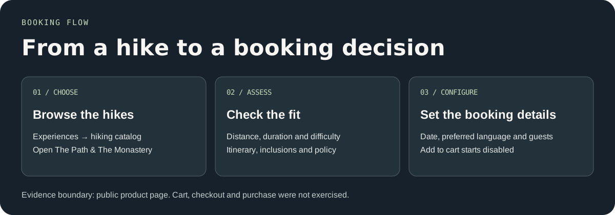
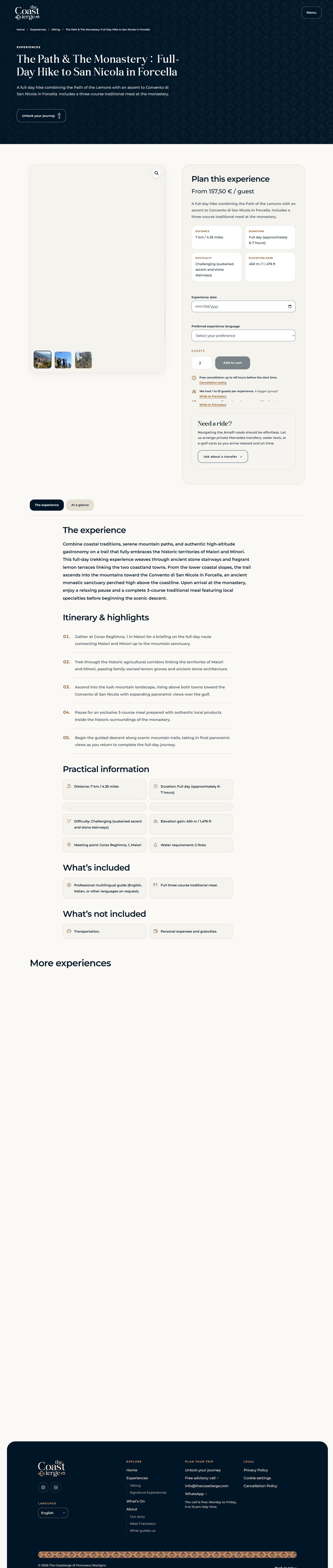
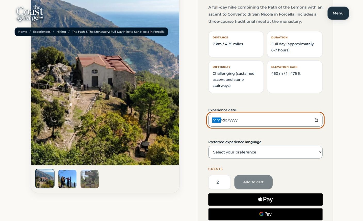
A hike can sound right and still be wrong for a guest’s group. The product page puts distance, duration, difficulty and elevation alongside the planning controls. Itinerary, inclusions and cancellation details answer the next set of questions before someone commits.
For The Path & The Monastery, the booking interface asks for a date, preferred language and guest count. The initial Add to cart state is disabled.
04 / UI system
Give inspiration and practical decisions different visual weight.
The site uses photography, serif headlines and dark coastal surfaces to establish a sense of place. Montserrat takes over for controls and trip facts, where visitors need to scan and compare. The warm, light surface in the booking area creates a clear transition from the experience story to the task.
#FAF9F6#001626#102B3DObserved on the live product page · Belgiano Serif for display and Montserrat for text and controls.
05 / Delivery & QA
Carry the booking details through to the guest handoff.
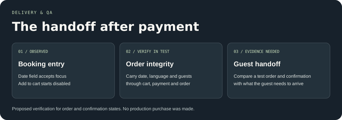
I carried the design through implementation and QA. The critical dependency is that the date, language and guest count selected on the product page stay consistent through the order and into the information the guest receives.
The evidence here covers the public interface through the date interaction. A test order and anonymized confirmation would let me document the payment and post-purchase handoff.
06 / What shipped
A live service with room for local judgment.
The Coastierge now has a public catalog of guided hikes, a journal for discovery, and a dedicated route into trip planning with Francesco. A traveler can move from exploring the coast to making a specific choice, while a guest who needs advice has a clear way to start that conversation.
Visit The Coastierge ↗